Why a Search Box Needs More Than a Magnifying Glass
Search box labels, examples and empty-state guidance show people what they can search and how to recover when no results appear.
The common search box mistake is to show an empty rectangle beside a magnifying-glass icon and assume people know what belongs in it. Clear search box labels, examples and no-results guidance can prevent guesswork, missed records and abandoned searches.
Say a neighbourhood arts centre has a directory of classes, performances and venues, and its records use formal names that visitors may not know. The design team decides to explain what the search accepts, then make the next move clear if a query returns no matches.
What should a search box label tell visitors?
A magnifying glass suggests that a field is for searching, but not what it searches. A visitor may wonder whether to enter an event title, venue, instructor or date.
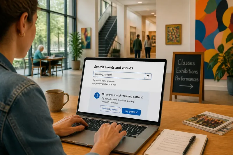
The team adds the visible label “Search events and venues” above the field. It stays visible after someone types, unlike a placeholder, which disappears as soon as text is entered. The team also associates the label with the search control in the page markup, so assistive technology can identify its purpose.
Make the label match the search’s actual scope. If the directory does not search instructor names, do not suggest that it does.
Which search examples make the rules clearer?
The arts centre’s search accepts event titles and venue names. The team adds a nearby hint, “Try a class name or venue”, and a short placeholder such as “e.g. pottery or Riverside Hall”. The hint explains the range of possible searches; the placeholder offers concrete starting terms.
Before using an example, check that it matches a real record and that the search can find it. Avoid internal terms such as “event ID” unless visitors are expected to know them. Do not show a date format or category as an example unless the search supports it.
In this invented scenario, the team enters “pottery” and “Riverside Hall” in the search and confirms that each term returns relevant records. The expected result is that visitors can recognise a useful kind of query without being led to believe that every related word will match.
Choose examples that show how to search, not a list of every possible rule.
What should happen when a search returns no results?
A bare “No results” reports the outcome but offers no help. The visitor cannot tell whether the phrase was too narrow, misspelt or outside the search’s scope.
For a search such as “evening pottery”, the empty state could say: “No events match ‘evening pottery’. Try a shorter term such as ‘pottery’, or search by venue.” This explains the outcome and offers actions that fit the search. Keep the original query visible so the visitor can edit it.
Show the message in the results area, where matches would normally appear. Use a loading indicator only while the search is still in progress; otherwise, visitors may not know whether to wait or try again. If the system suggests a corrected term, present it as an option and let visitors return to their original query.
How can you check a search box before release?
Review the field and its responses against concrete cases. For each check, compare what the interface promises with what the search actually does, then make the indicated change if they do not match.
- Observe whether a visible label names what the field searches; if it does, keep it, and if it does not, replace it with a specific label such as “Search events and venues”.
- Observe whether the label remains visible after text is entered; if it does, keep its placement, and if it disappears, move the explanation out of the placeholder.
- Observe whether each sample term returns a relevant record; if it does, keep it as an example, and if it does not, replace it with a supported term.
- Observe whether the hint mentions only supported search fields; if it does, keep it, and if it promises unsupported fields, revise the hint to match the search.
- Observe whether an empty search response explains what happened and suggests a next action; if it does, keep the message, and if it only says “No results”, add a realistic option such as shortening the query.
- Observe whether the empty-state message appears in the results area; if it does, keep the placement, and if the page looks blank, display the message where visitors expect results.
- Observe whether the search field and submit control have clear names when reached by keyboard or read aloud; if they do, keep the accessible names, and if they do not, associate the label and give the button a descriptive name.
Imagine the arts centre’s directory accepts event titles and venue names but not instructors. Starting with the hypothetical query “evening pottery”, the team checks the label, which says “Search events and venues”, and keeps it because it matches the actual scope. It checks the placeholder “e.g. pottery or Riverside Hall” against the directory and keeps both terms if they return relevant records. The query “evening pottery” produces no match, so the team places “No events match ‘evening pottery’. Try ‘pottery’ or search by venue” in the results area. The resulting decision is clear: a visitor can shorten the query or use a venue name, while the interface avoids promising an instructor search it cannot perform.
What should you know about search box labels and empty states?
Should a search label be inside or above the field?
Use a persistent visible label above or beside the field so its purpose remains clear after typing begins. A placeholder can add an example, but should not replace the label.
What makes a search example useful?
Choose a familiar term the search actually accepts, such as a class name or venue. If the search supports several kinds of query, show a compact range without implying that unsupported terms will work.
What should a no-results message include?
State that no matches were found and offer a practical next action, such as shortening the phrase or trying another supported field. Keep the advice within the search’s actual scope.
Should a search interface suggest a different query?
It can offer a plausible correction, but visitors should decide whether to use it. Keep the original query available and do not silently replace it.
How should the search box work across the whole journey?
Check the field before typing, while entering a query and after results appear. On a narrow screen, the label and submit control should remain easy to identify; by keyboard, the field and button should be reachable; with assistive technology, each control should have a clear name. Feedback should not rely on colour alone.
If results update as someone types, make changes understandable without interrupting entry. Above all, keep the label, examples and empty-state advice consistent with the records the search can actually find.
Review the search box labels, examples and empty-state message together whenever the search scope changes. A visitor should be able to understand what to enter, what happened and which useful option to try next.